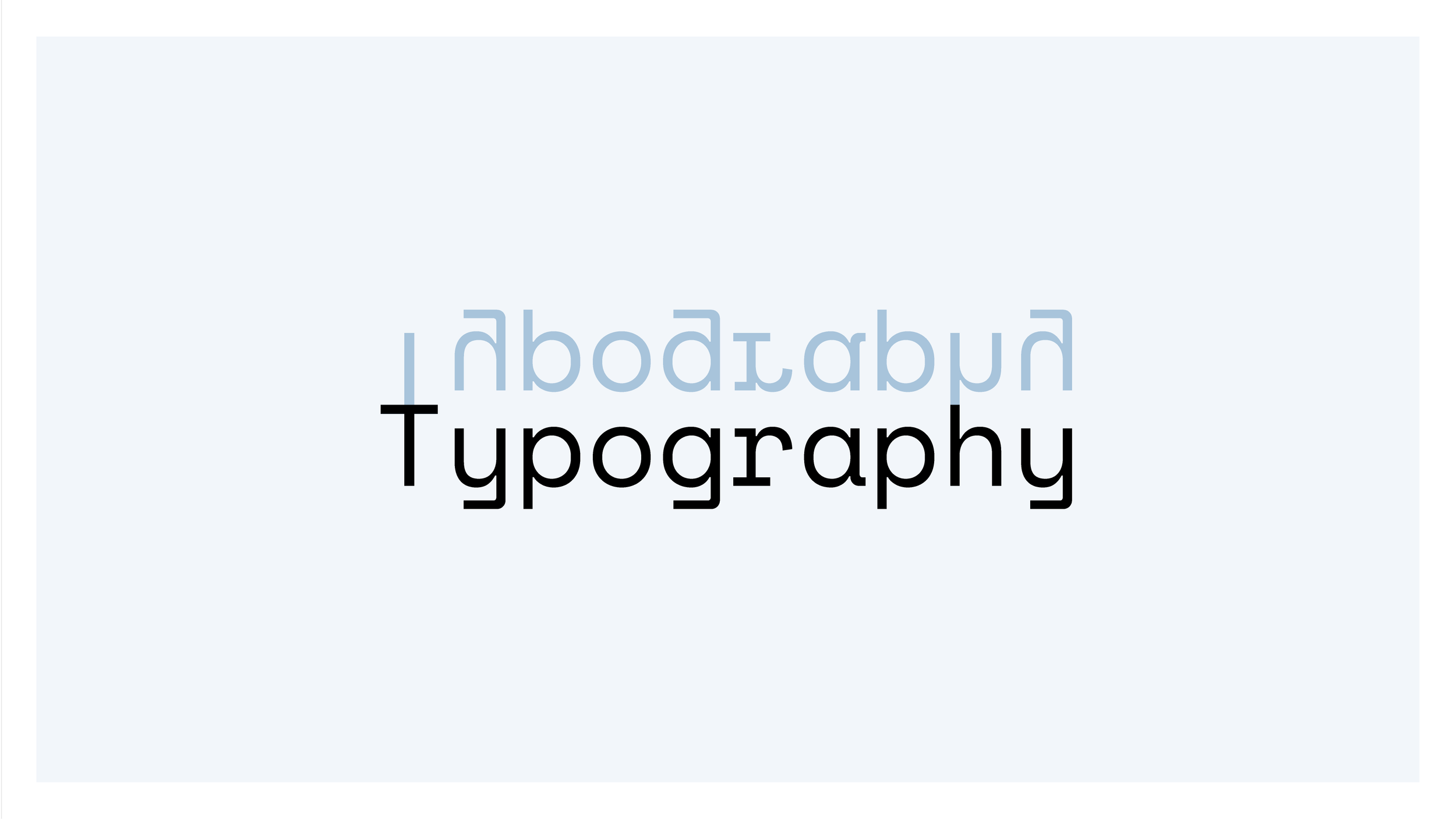
Typography
We are straying into nerd territory here, so I shall keep this part as succinct as possible.
Words bring meaning. Fonts bring feeling.
The art of typography has an enormous vocabulary of terms, but we are only going to skim the surface. The most important thing to know is called the visual hierarchy of text. What this means is that the largest text will always be read first. Like a headline in a newspaper.
The visual hierarchy allows the person designing to guide the reader’s eye in the order that they deem correct.
Without a text-based hierarchy, it’s very hard to follow what’s happening. Text will be read out of order, it becomes harder for people to sequence the information correctly.
Use three typography sizes:
One very big for headlines.
One smaller for sub-headers.
And one for bodies of text.
That’s the main takeaway here.
— Typography Basics
-
![]()
Typography — Type (for short) is the arrangement of letters to form words in order to make them legible and easy on the eye.
-
![]()
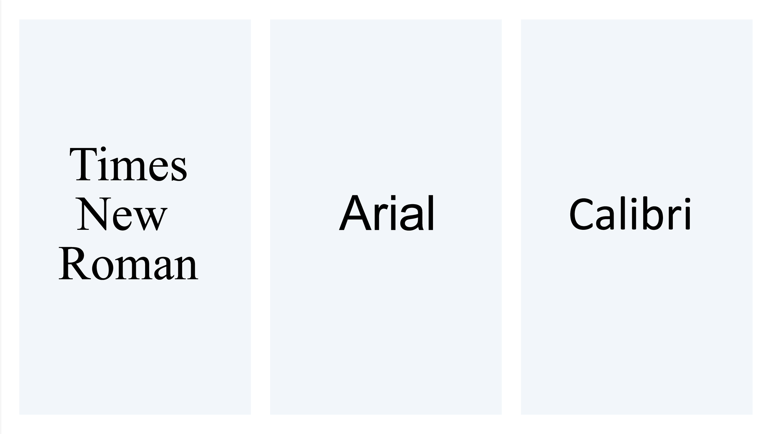
Typefaces — These are a group of fonts sharing the same form like Times New Roman, Arial and Calibri.
-
![]()
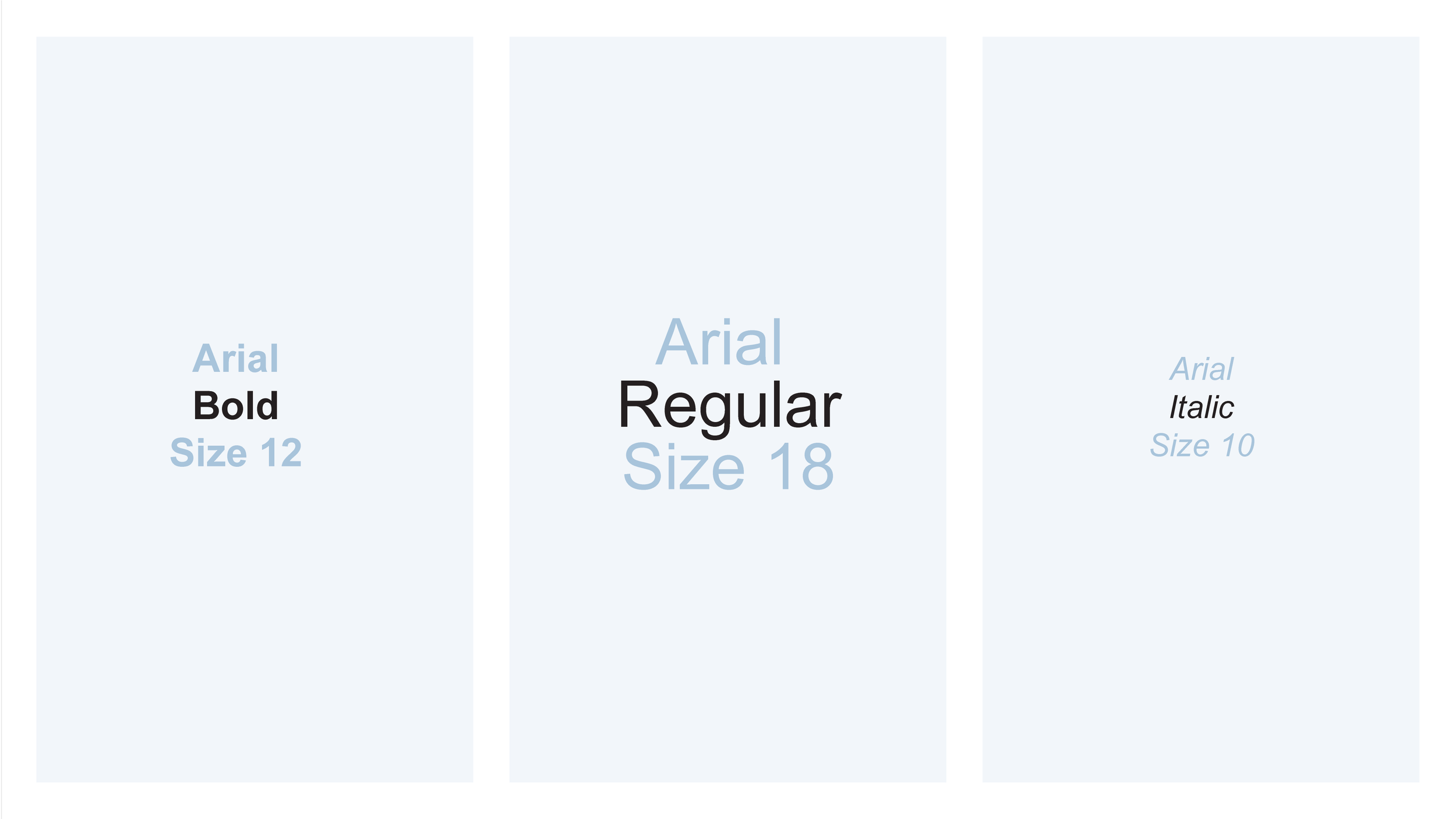
Fonts — A font is the specific form (style, weight, and size) of a typeface. The above example, contains three separate fonts. Even though they are all Arial.
-
![]()
Classifications — There are a number of different versions, but for now let’s concentrate on the two most common typeface forms.
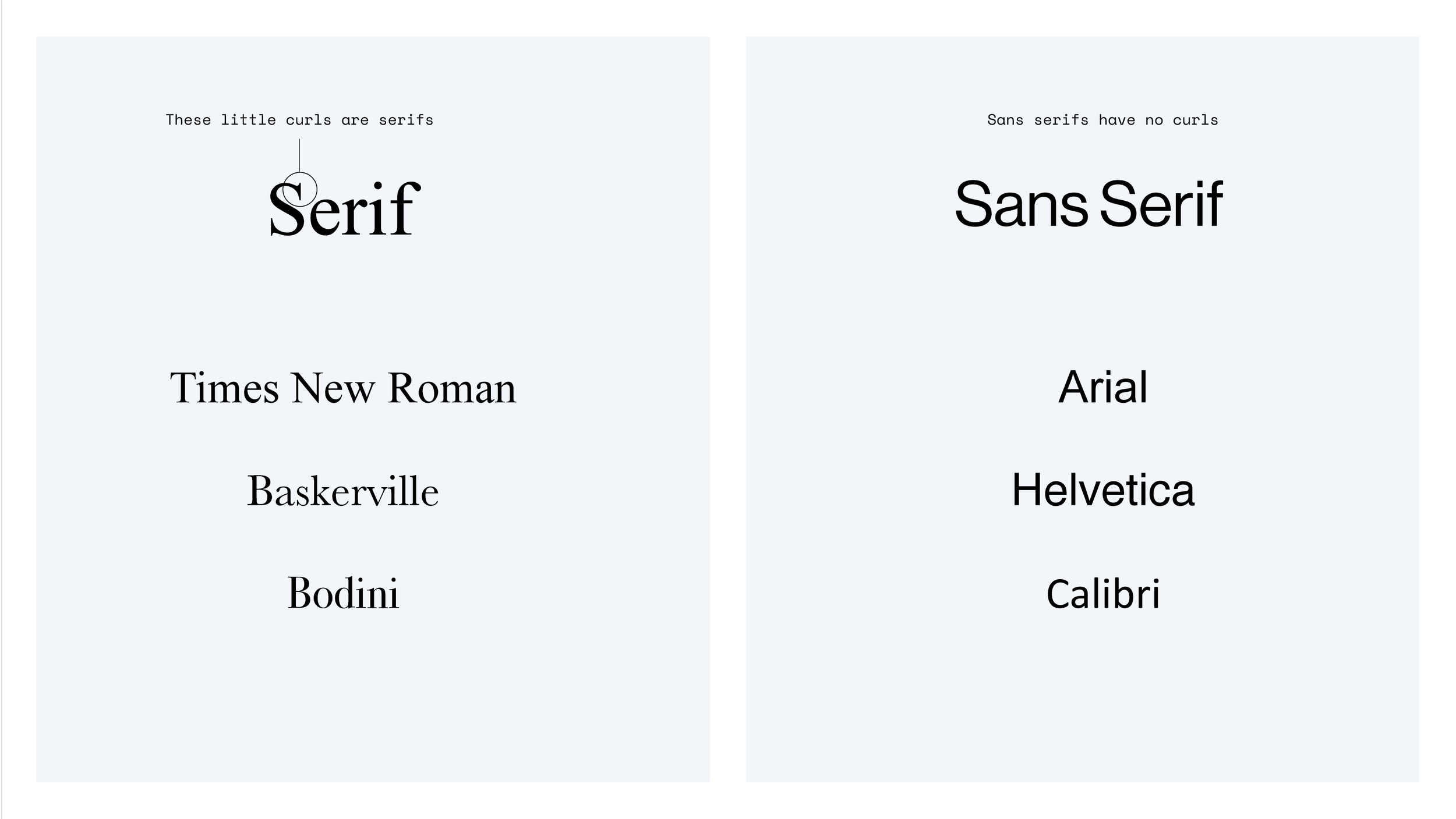
— Reading Pattern
-
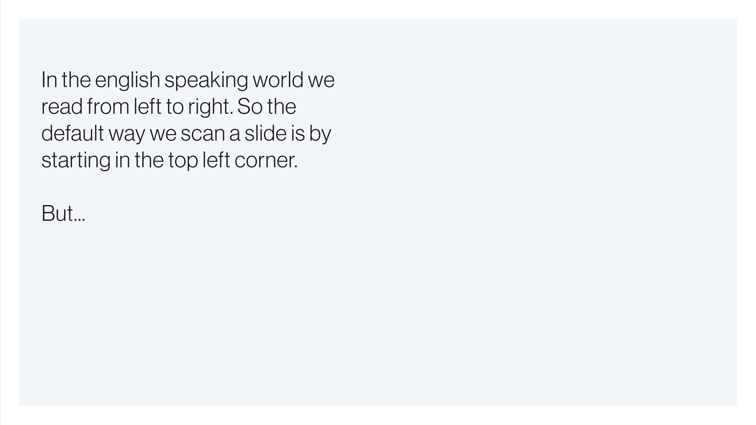
![]()
Left to right — The type can interfere with our natural reading pattern.
-
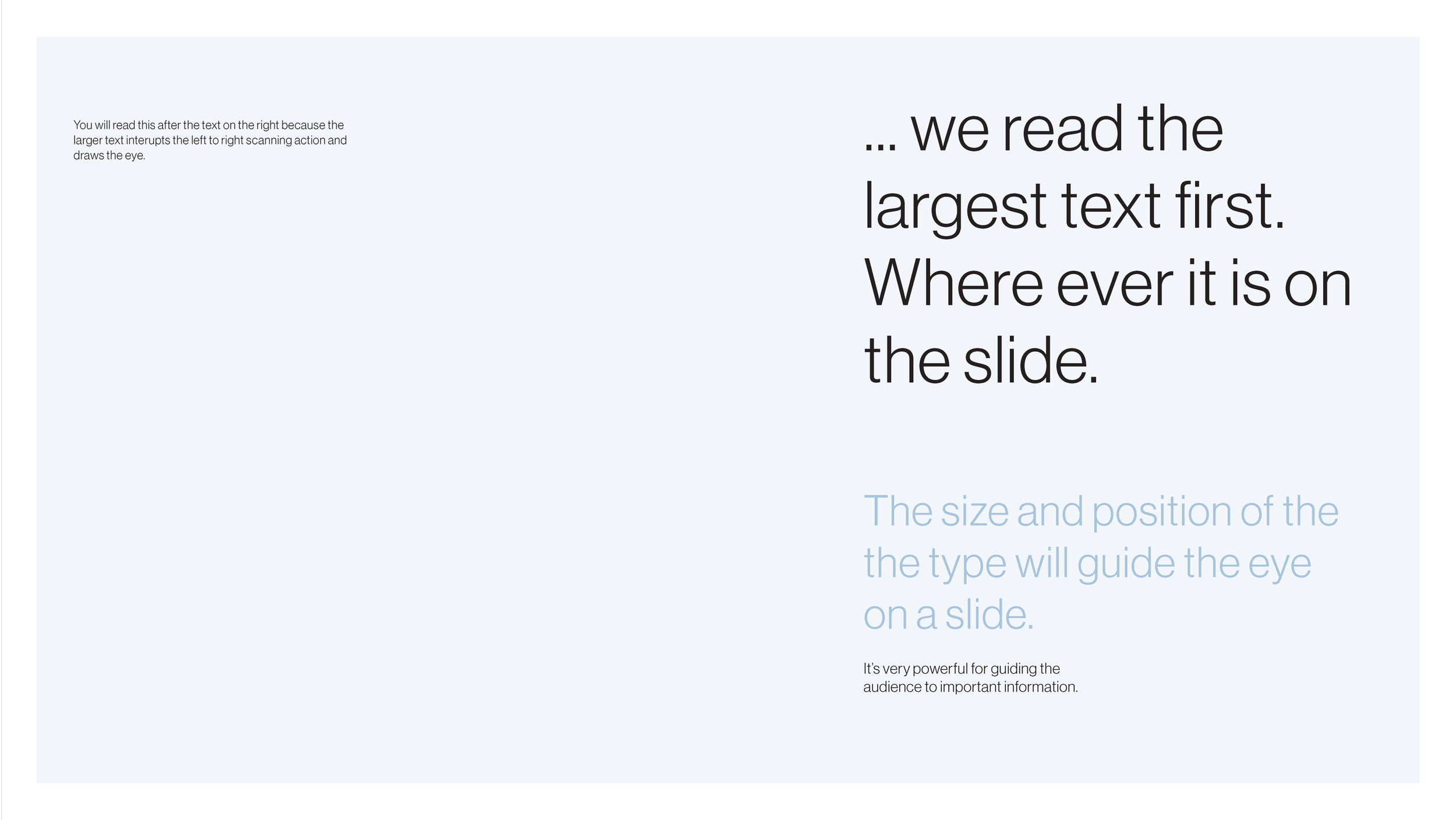
![]()
Large first. Small next — The eye is always drawn to the largest text on the page
— The Hierarchy
-
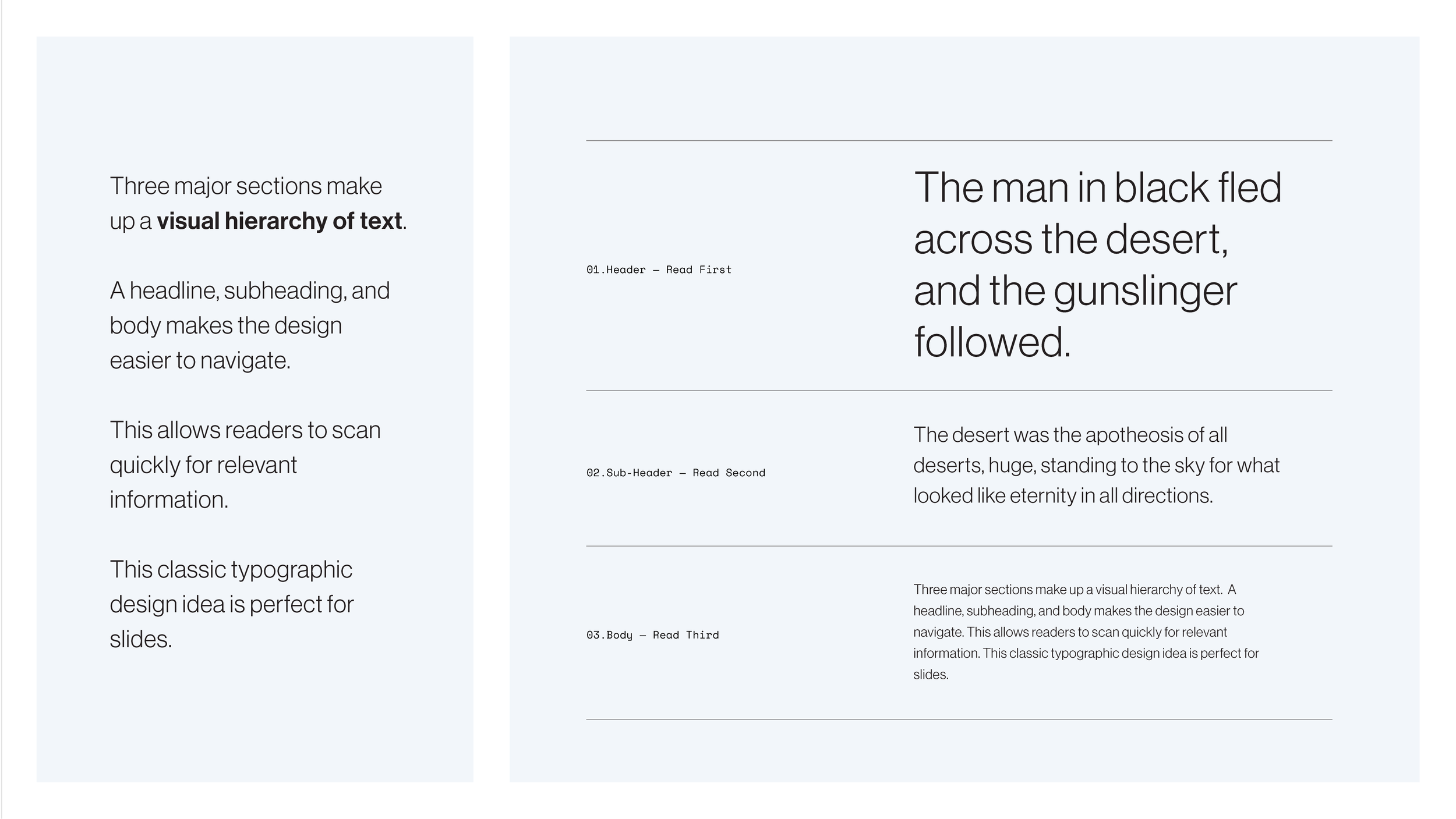
![]()
The Text Hierarchy — To take control of directing the eyes, use a simple visual hierarchy like this.
-
![]()
Hierarchy in use — Three parts, left to right. Begins with larger text in the first column, than smaller as it progresses.
-
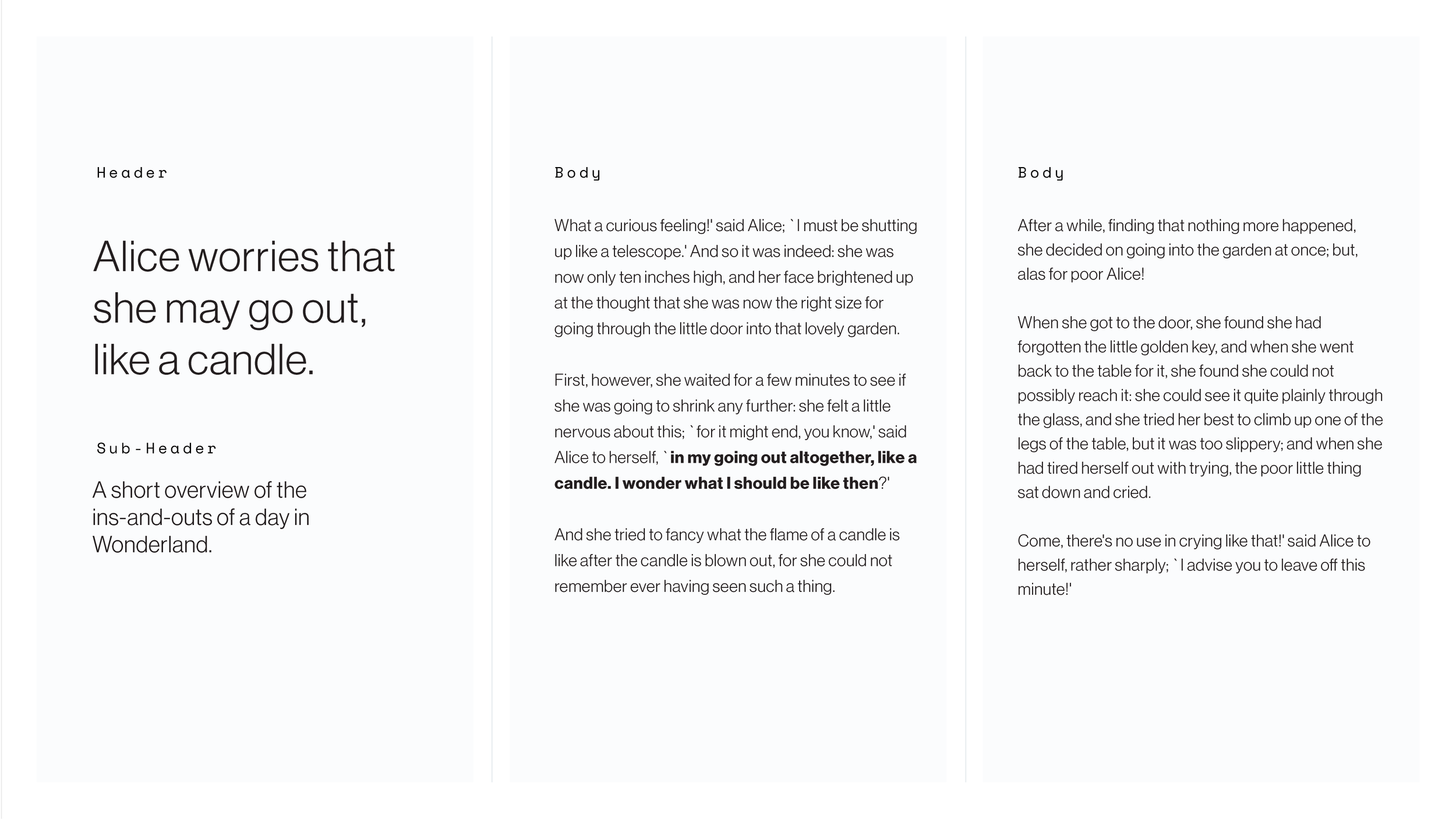
![]()
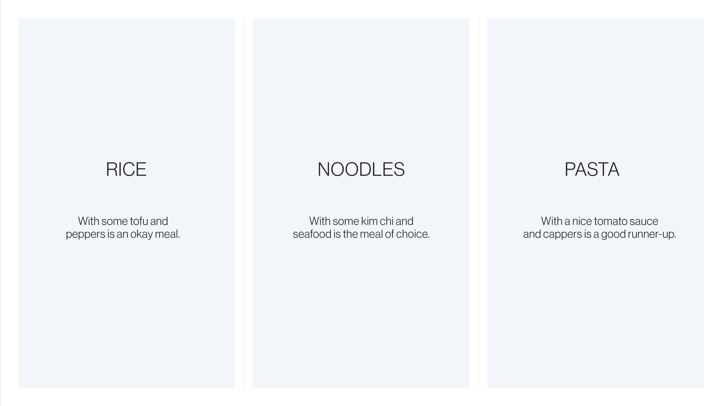
Flat hierarchy — Each part here is equal.
-
![]()
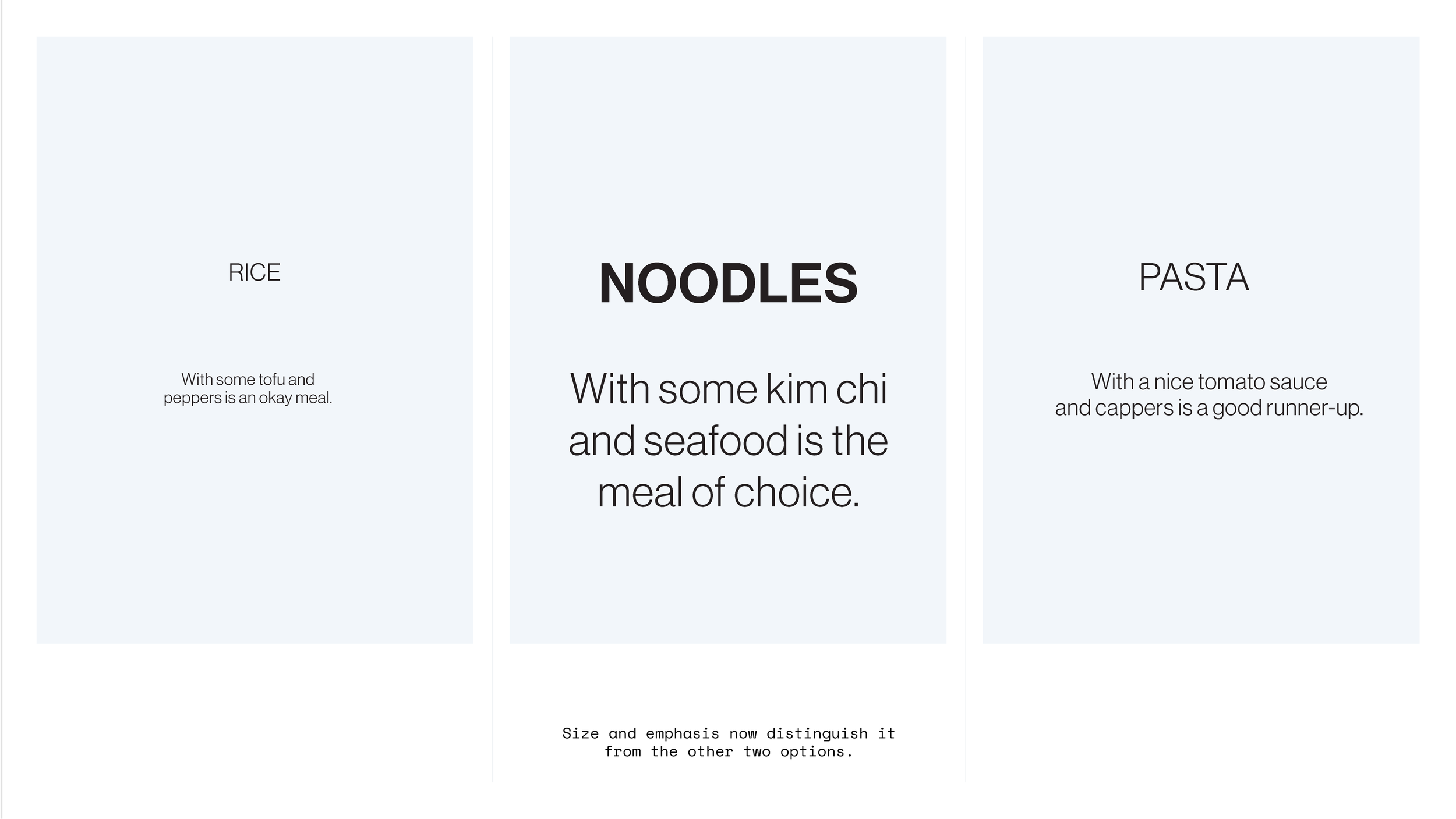
Distinct hierarchy — Noodles jumps off the page now.
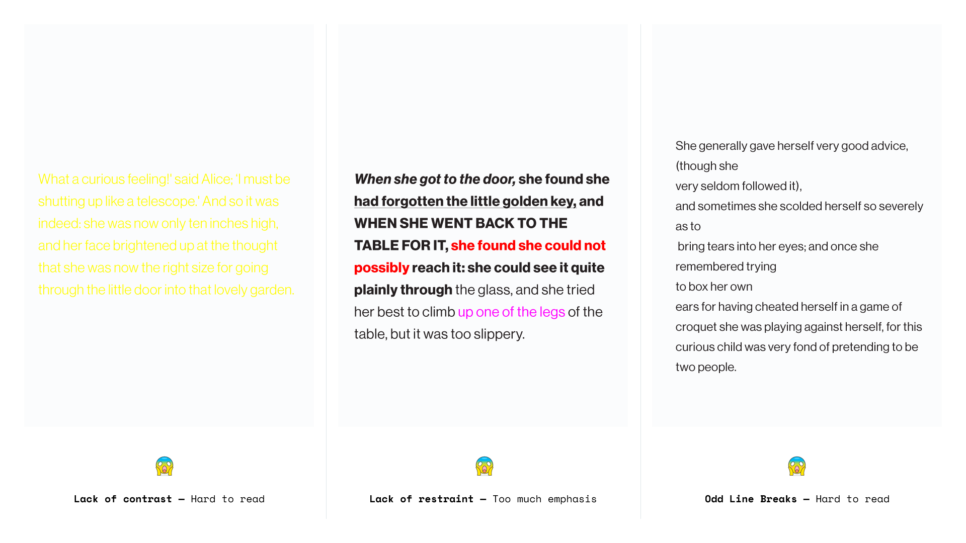
— Common Issues
-
![]()
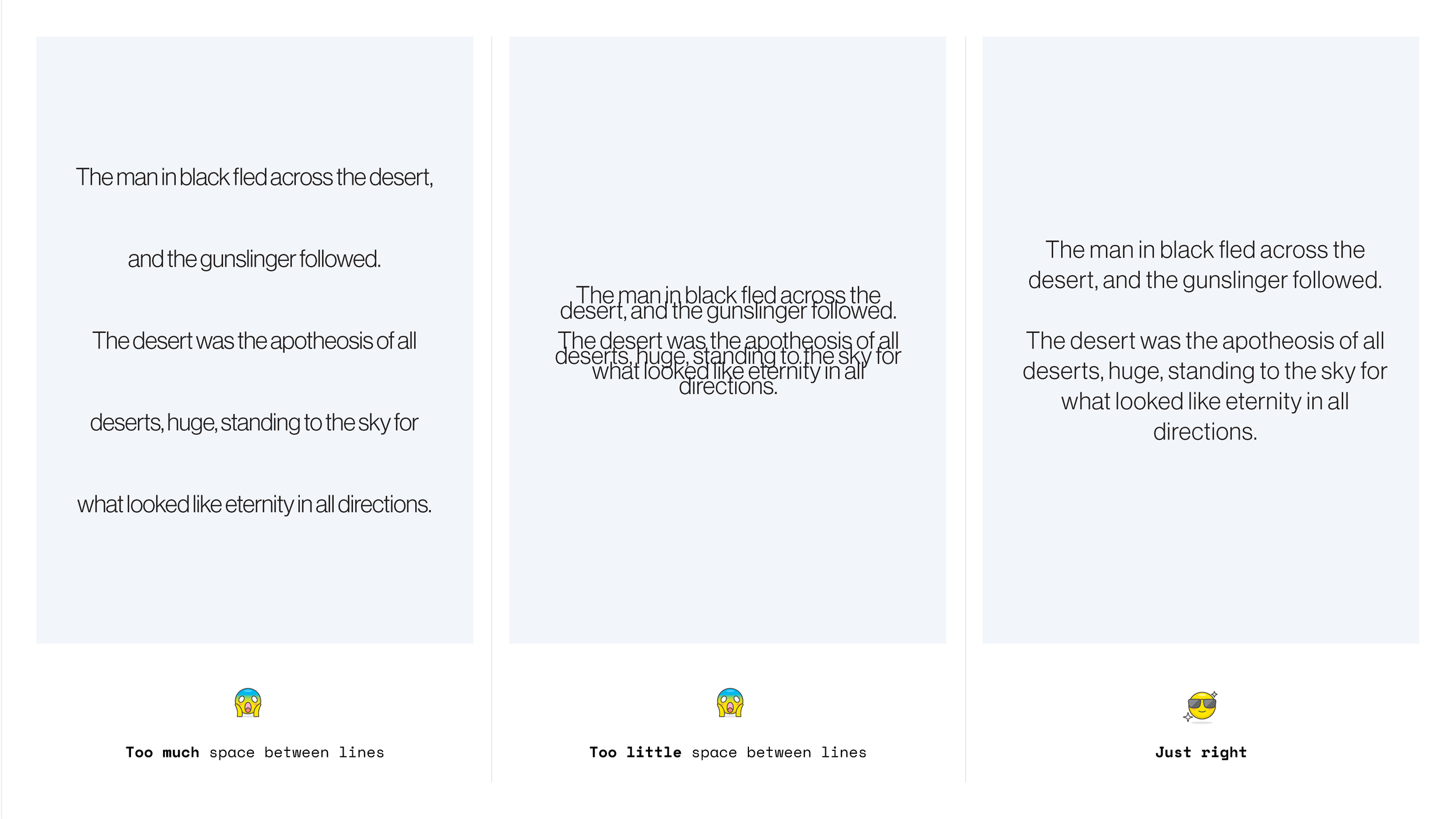
Leading — The space between each line of text. Too much will tire the reader’s eyes, too little means the text becomes obscured.
-
![]()
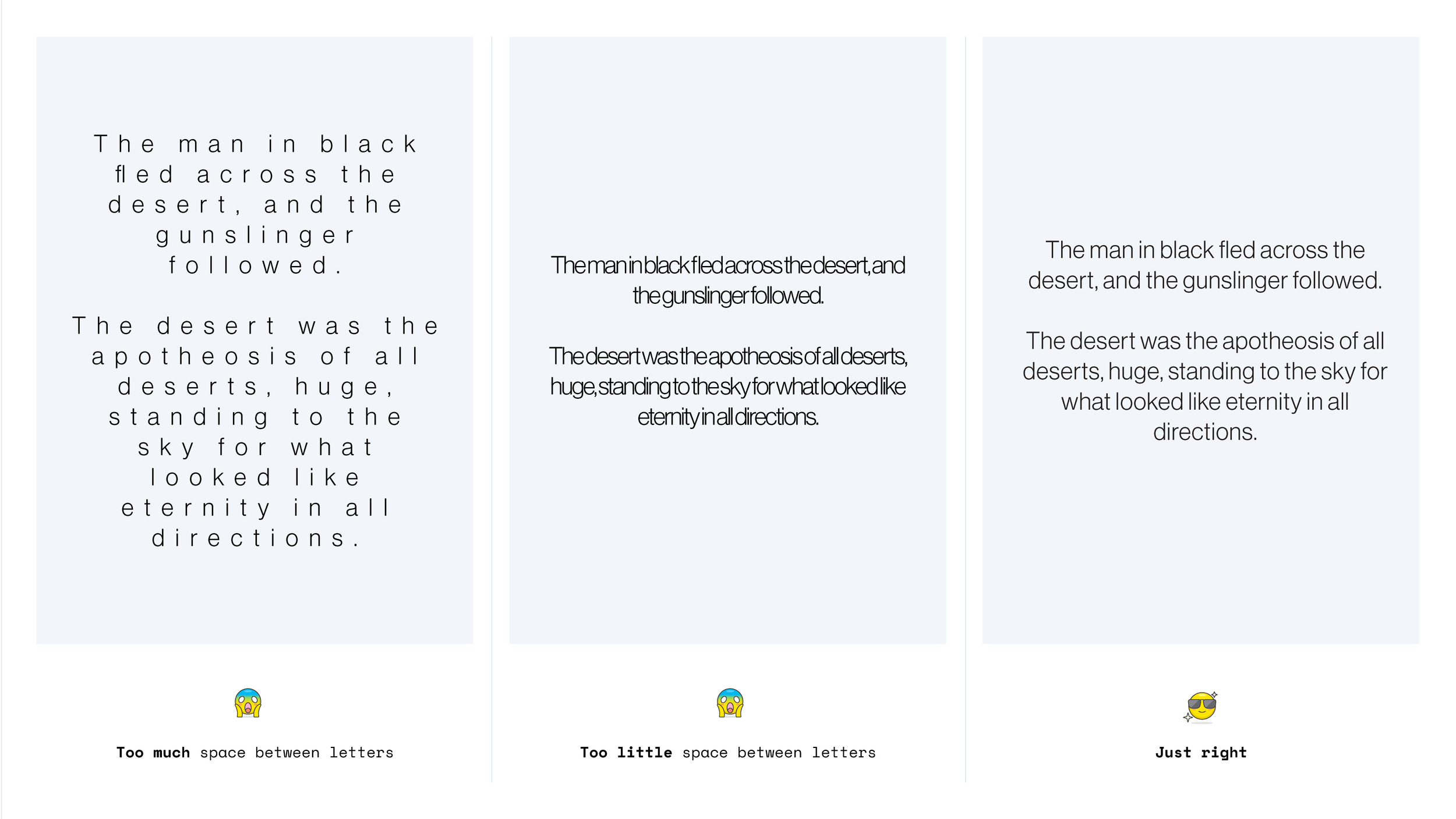
Tracking & Kerning — The space between the letters and words affects the legibility.
-
![]()
Issues
-
![]()
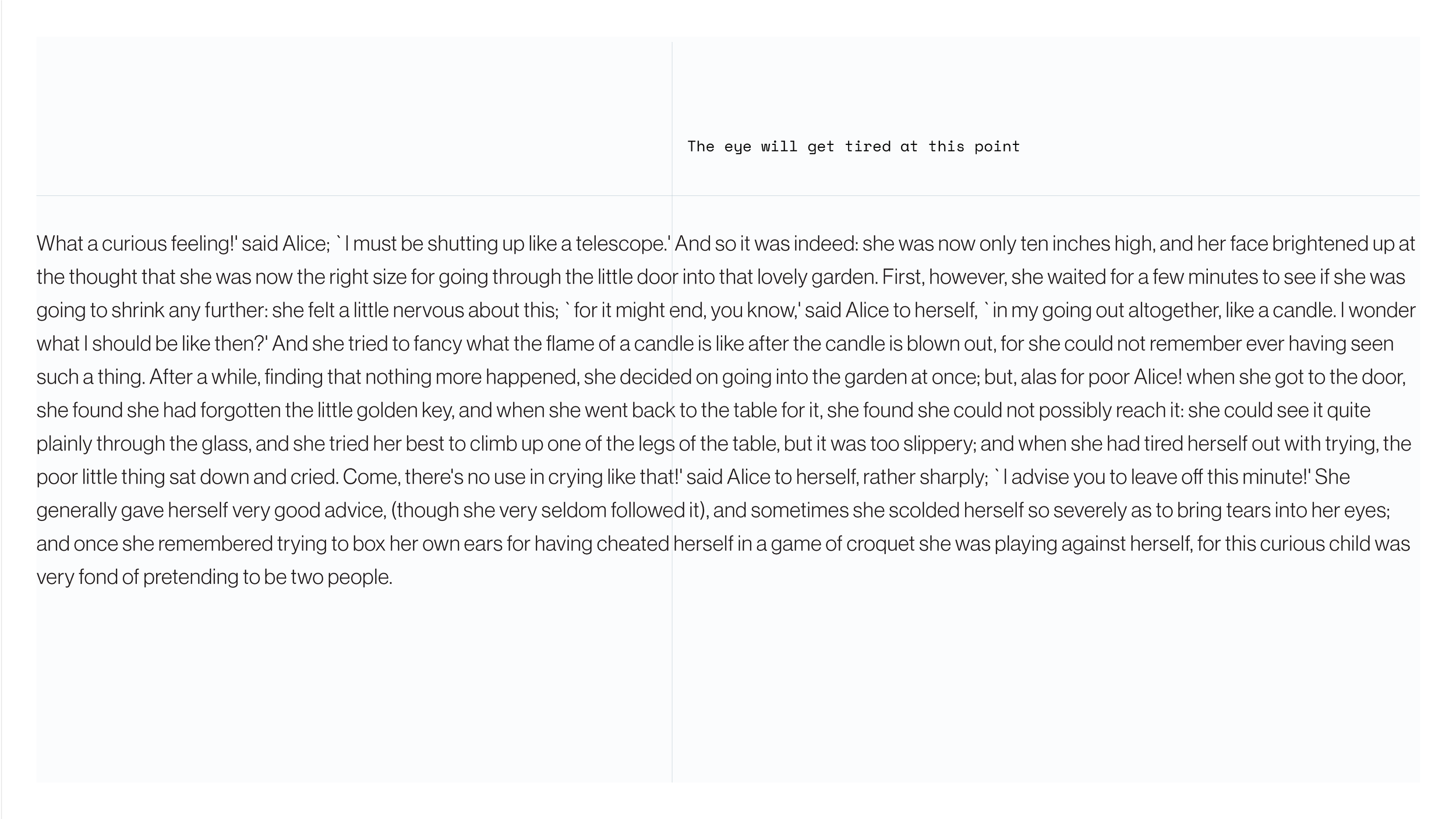
Line Length — Too many words on one line becomes intimidating for the reader, and makes it difficult to concentrate.
-
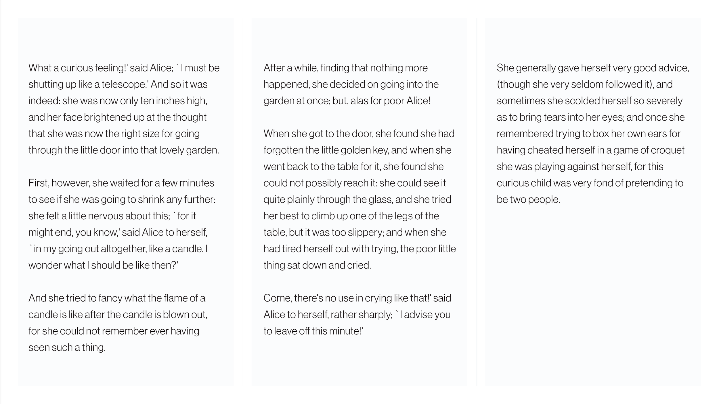
![]()
Tidy Columns — Splitting large bodies of text into columns can solve this issue.
🚀 Where to Start
If you stick to three sizes, and a limited mixture of typefaces, you needn’t spend too much time worrying about typography.
Most software applications will also handle leading and tracking for you, so it should be rare that you need to adjust these.