Colour
Fluency in colour allows entire new worlds to reveal themselves to you.
Let us begin with a bombshell. Colour is a lie. There is no colour in the world, atoms are colourless. All of the colours that we ‘see’ are a blend of three cones that sit in the eye: red, green and blue. These cones create colours that our brain then interrupts as what we think of as green, yellow red, blue etc.
Yet, for something that doesn’t exist, colour holds incredible power over us, and it can invoke strong emotional responses.
While colour theory is a complex subject, it isn’t particularly complicated to learn the basics. And that’s all you need really.
Colour is a curious thing because so many people seem to be wary of it. And we don’t notice this wariness until it’s pointed out. Most homes have muted colours schemes, and even those with vibrant colour invariably stick to one on trend hue.
Our clothes tend to be muted hues, with the odd bright dress or sweater. Car colours are limited to mostly greys, blacks and blues.
Vibrant colours then, scare people. My theory is because when they’re not combined nicely, it’s garish. And who wants to be thought of as garish.
An curious oddity arises in visual communications created by a novice though. All the wariness goes out the window. Garish becomes the default.
For that, I have no theory, but hopefully the following will help you and your slides be less garish.
— Colour Basics
-
![]()
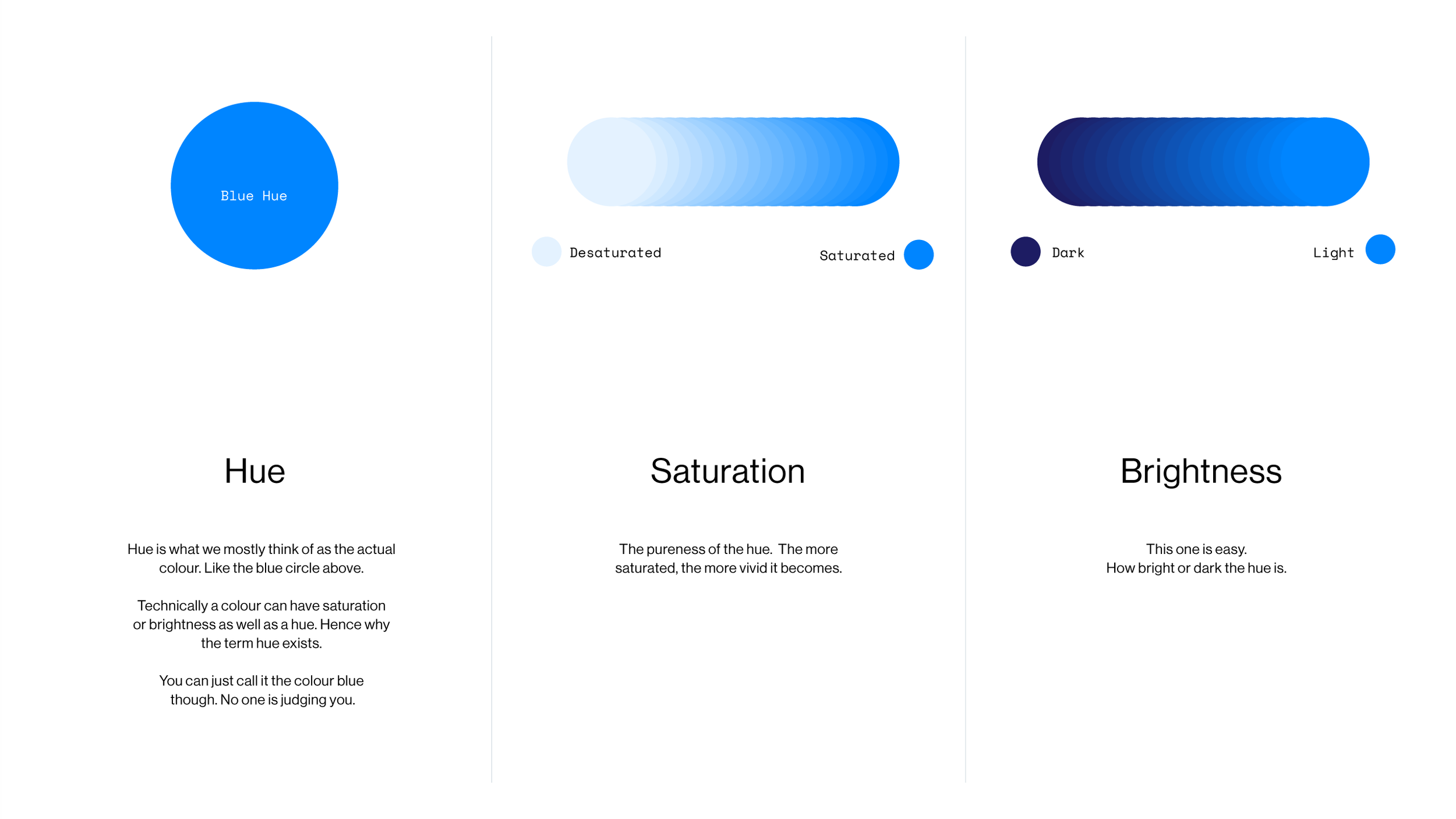
Colour terms — Technical, but interesting.
-
![]()
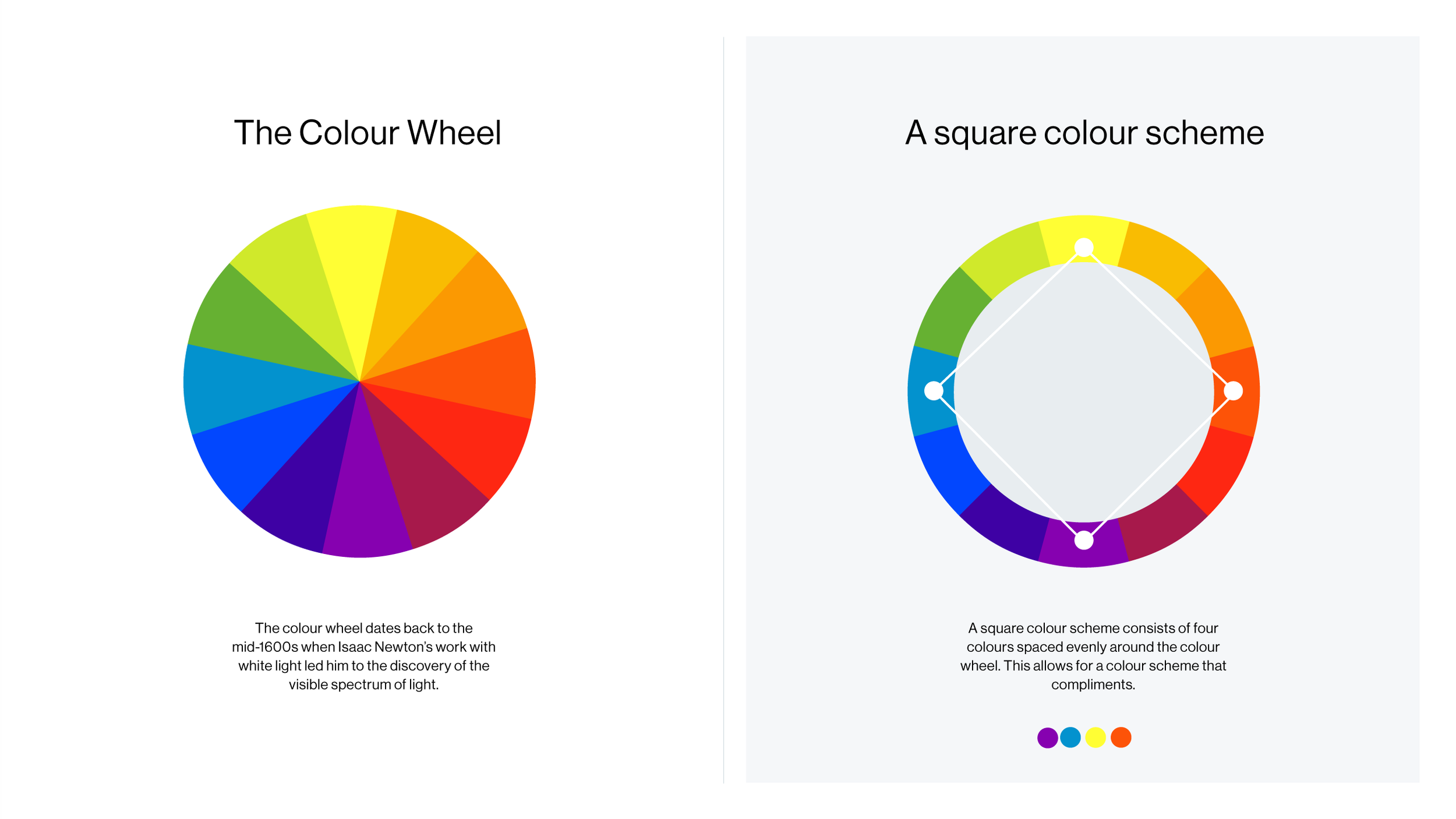
The Colour Wheel — Discovered in ye olden days, the wheel is made up of 12 hues.
-
![]()
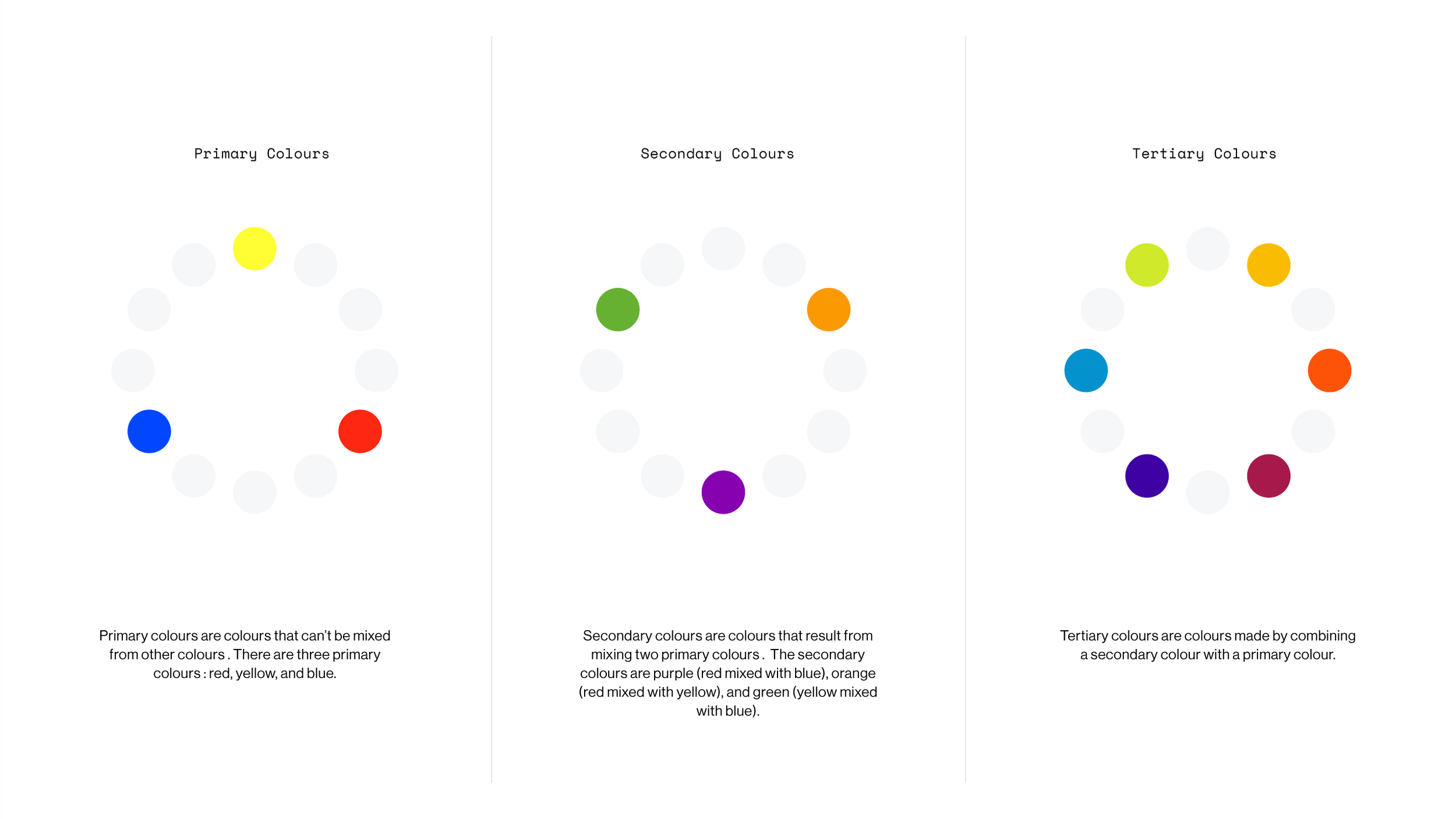
Primary, secondary & tertiary — The wheel is split into three colour types.
-
![]()
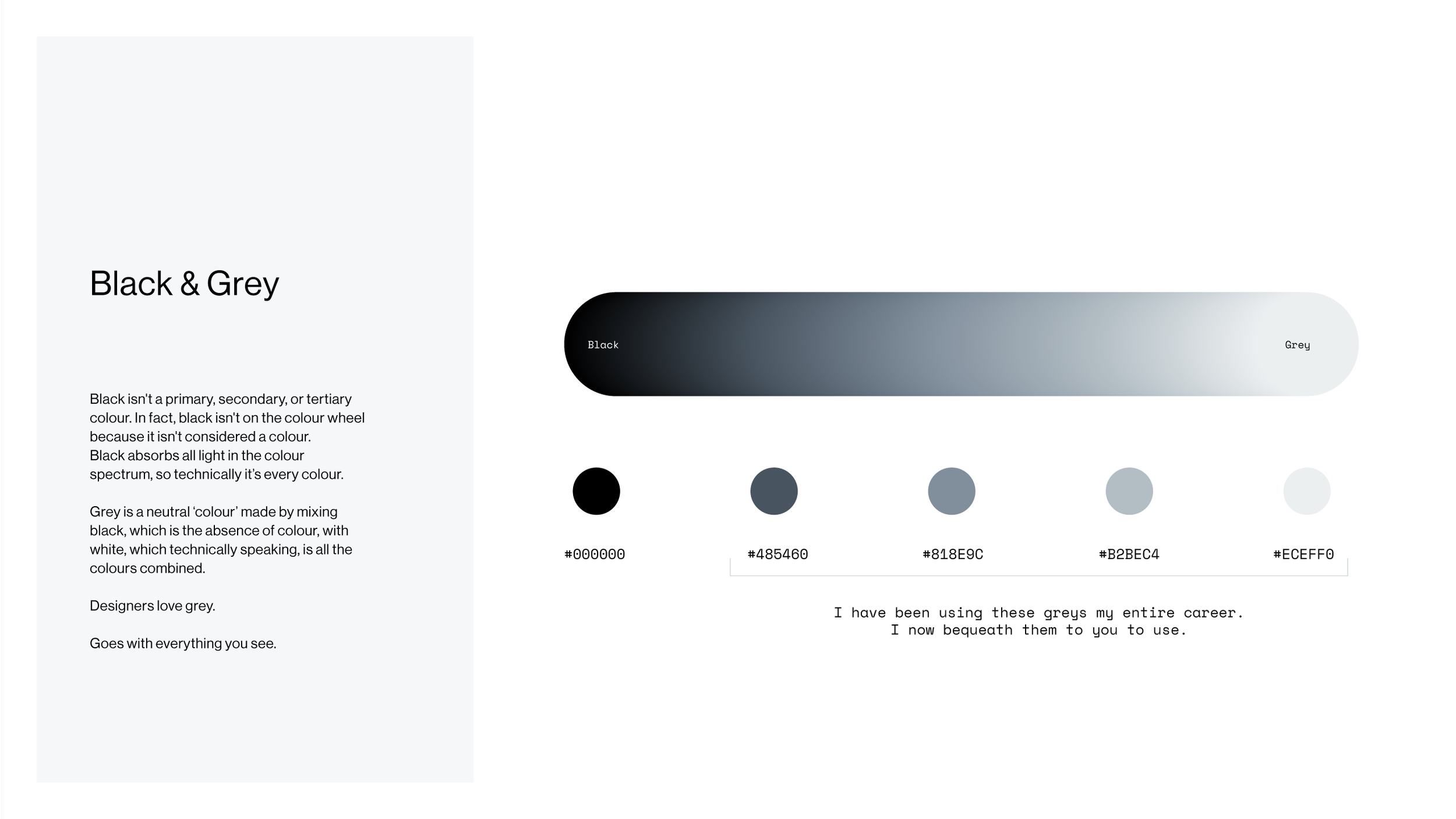
FYI — Black is not a colour.
-
![]()
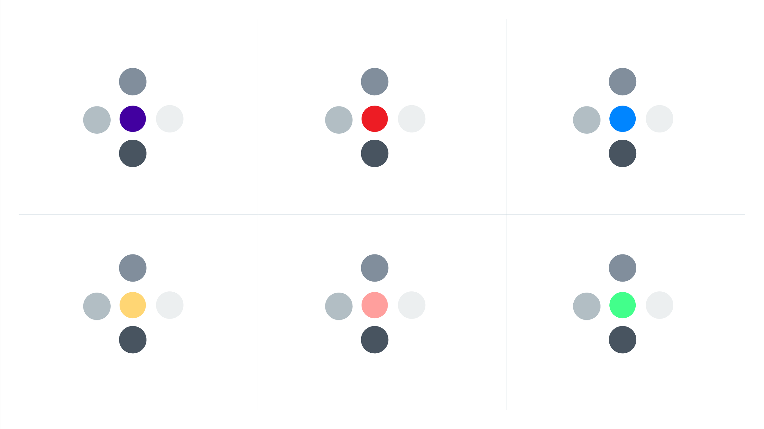
Useful Greys — They fit in with every other colour so they are very handy.
-
![]()
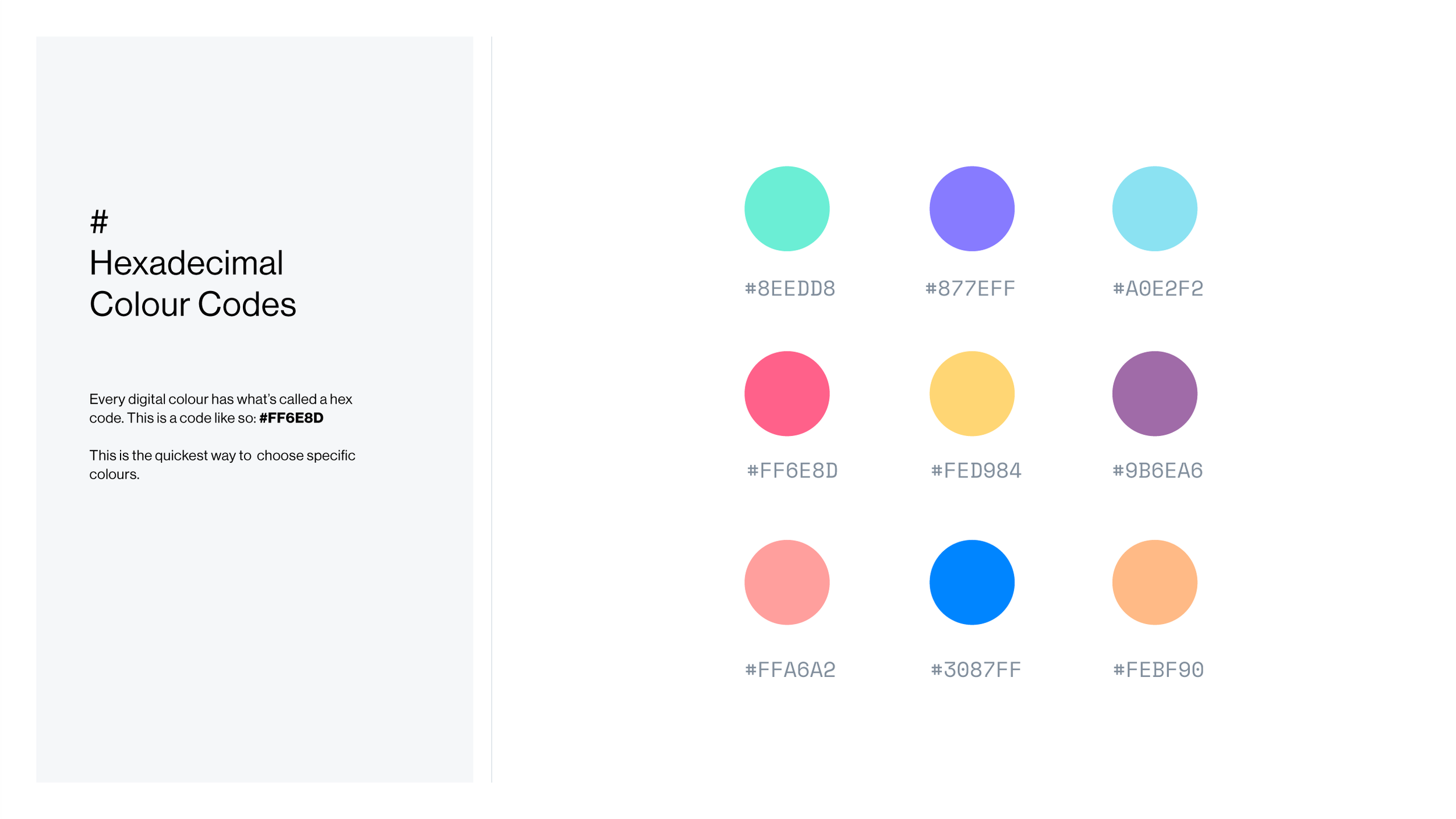
Hex Colour Codes — Sample
— Choosing Colours
-
![]()
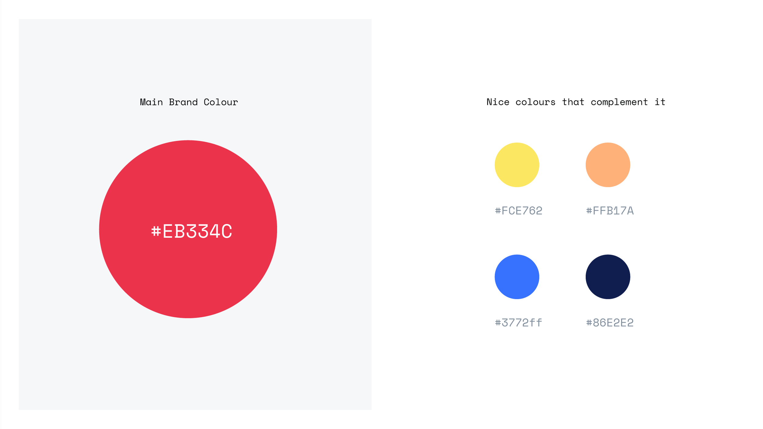
Brand Colour — If you don’t have access to your company’s colour palette, take the main colour and use a generator to find nice combinations.
-
![]()
Internal / External — External comms need to stick to the main brand colours, but with internal comms you have leeway to use more colours.
-
![]()
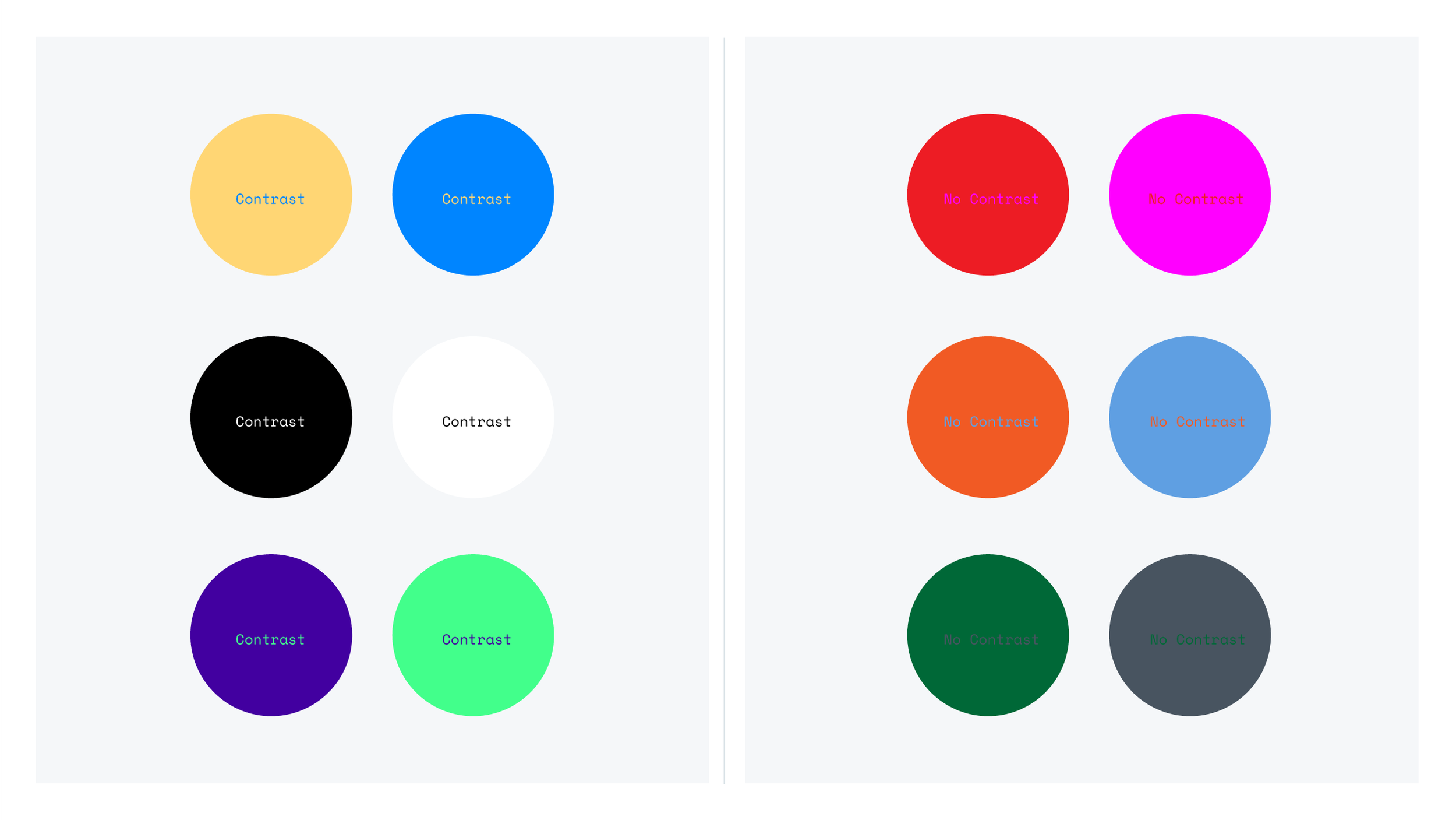
Contrast — Colours that work nicely together generally contrast well together.
-
![]()
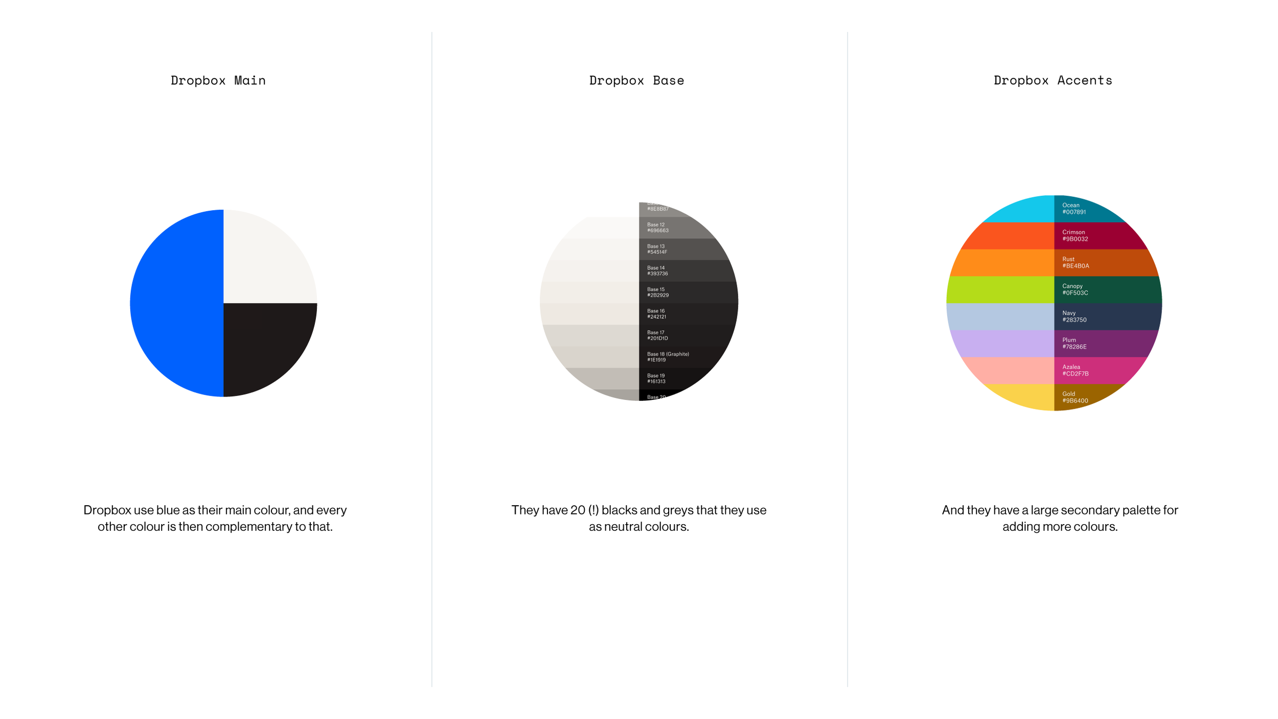
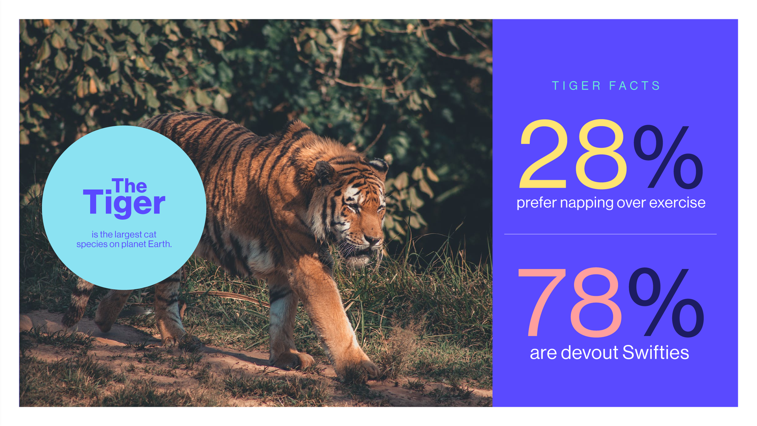
Harmony — It’s easier to keep colours to two or three, but once they all work together you can use as many as you want. There’s 14 used here.
— Using Colour
-
![]()
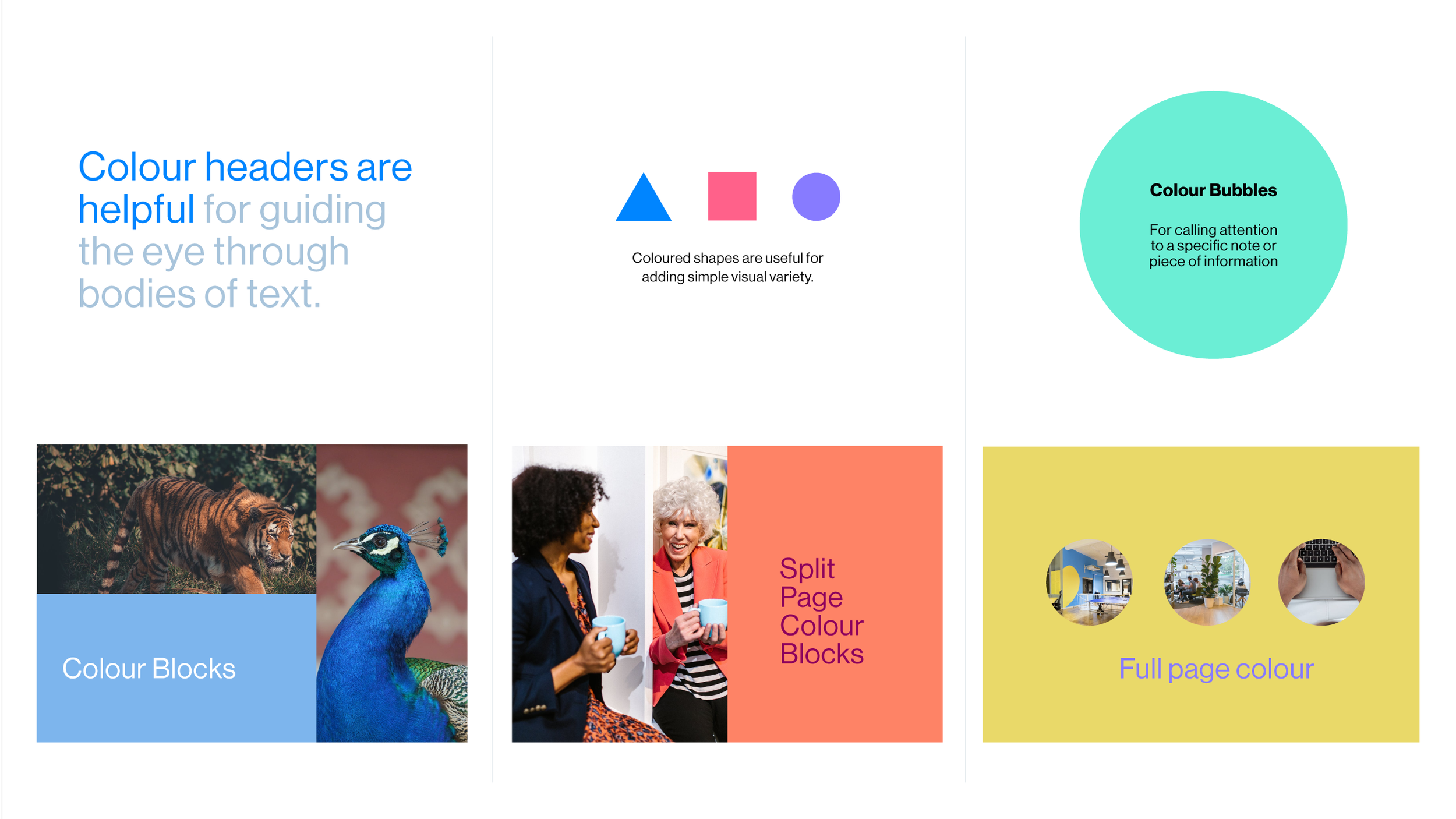
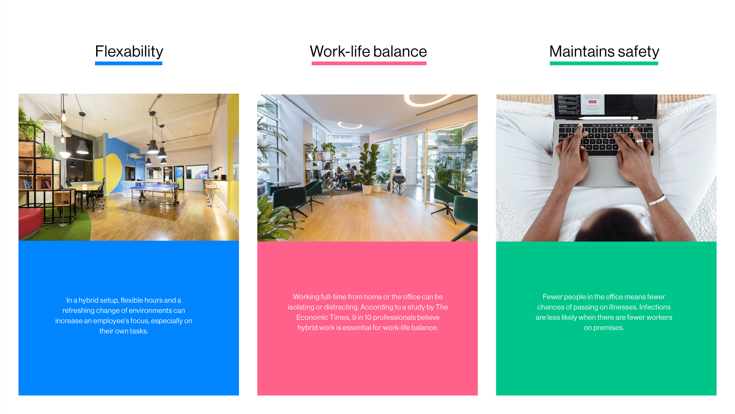
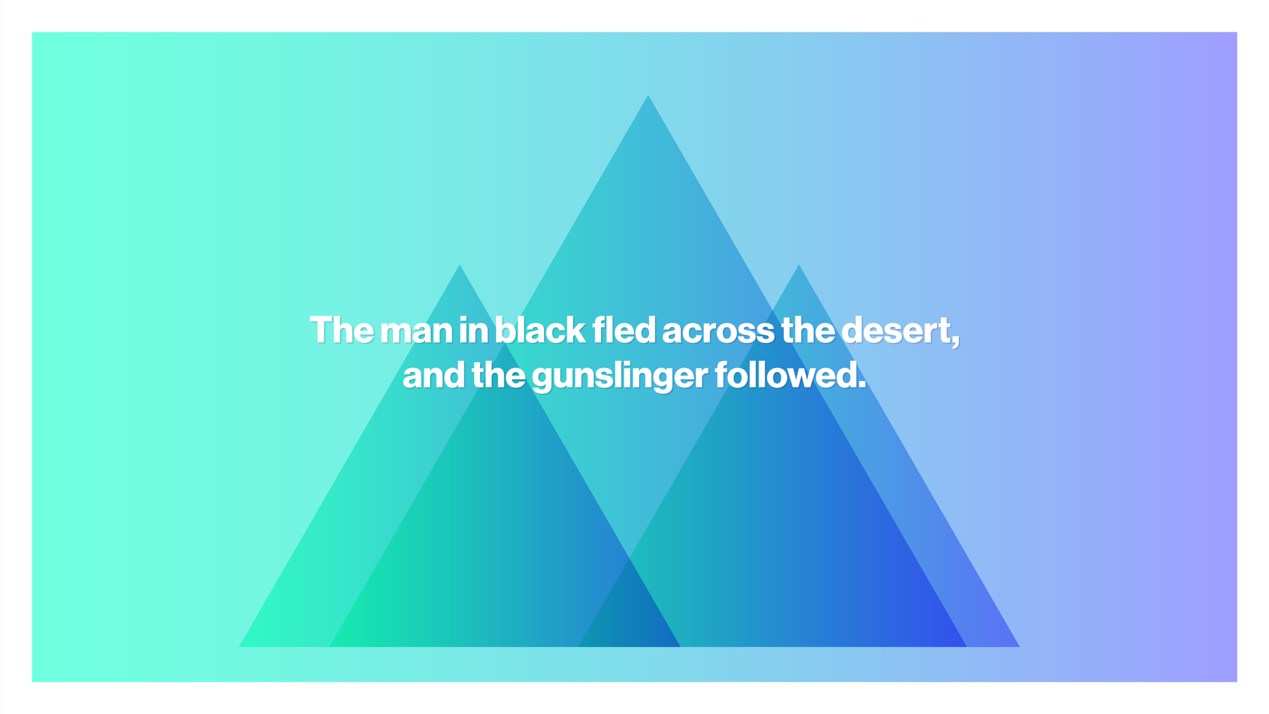
Nice ways to use colour
-
![]()
Nice ways to use colour
-
![]()
Nice ways to use colour
-
![]()
Nice ways to use colour
-
![]()
Nice ways to use colour
-
![]()
Nice ways to use colour

— Gradients & Image Palettes
-
![]()
Nice Gradients — A gradient is a blend of two or more colours that smoothly flow into each other.
-
![]()
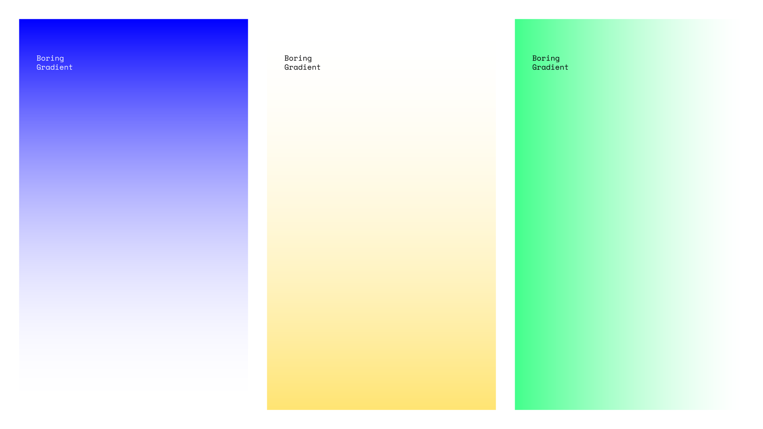
A Boring Gradient — A single colour gradient blends into white, and they are not the most easy on the eye. Avoid.
-
![]()
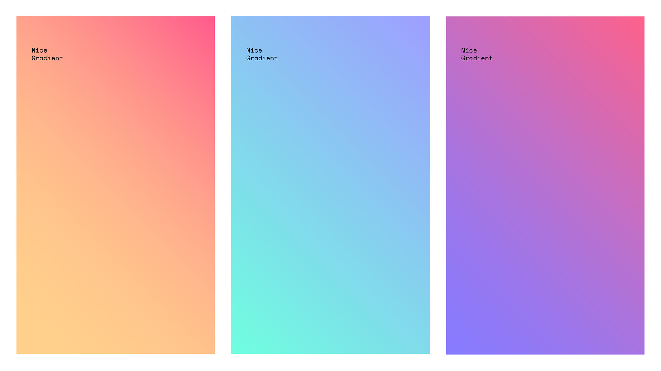
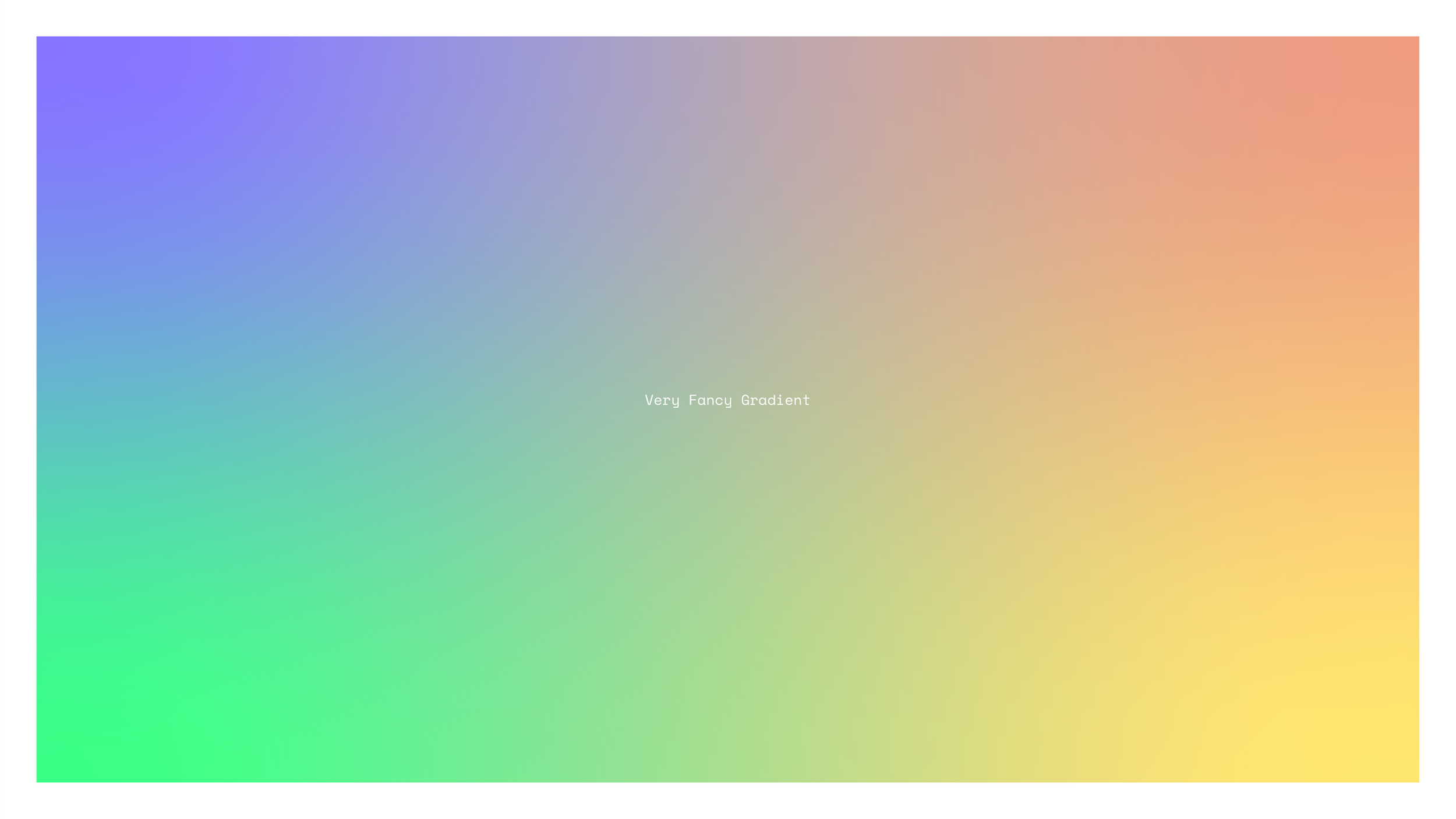
Fancy Gradients — There are four colours in this gradient, hence the fanciness.
-
![]()
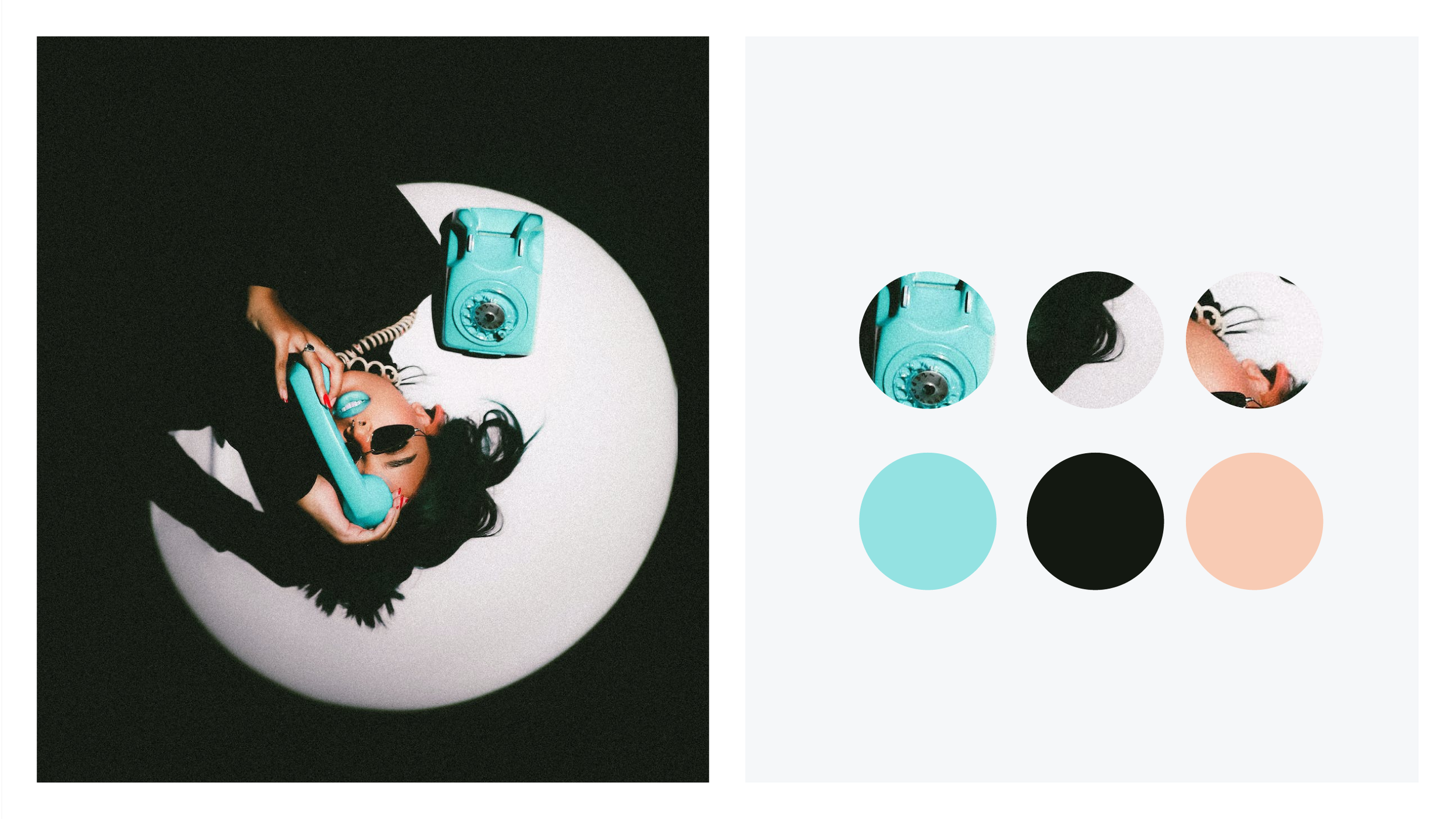
Photographs — These can be colour matched by using similar colours to create nice effects.
-
![]()
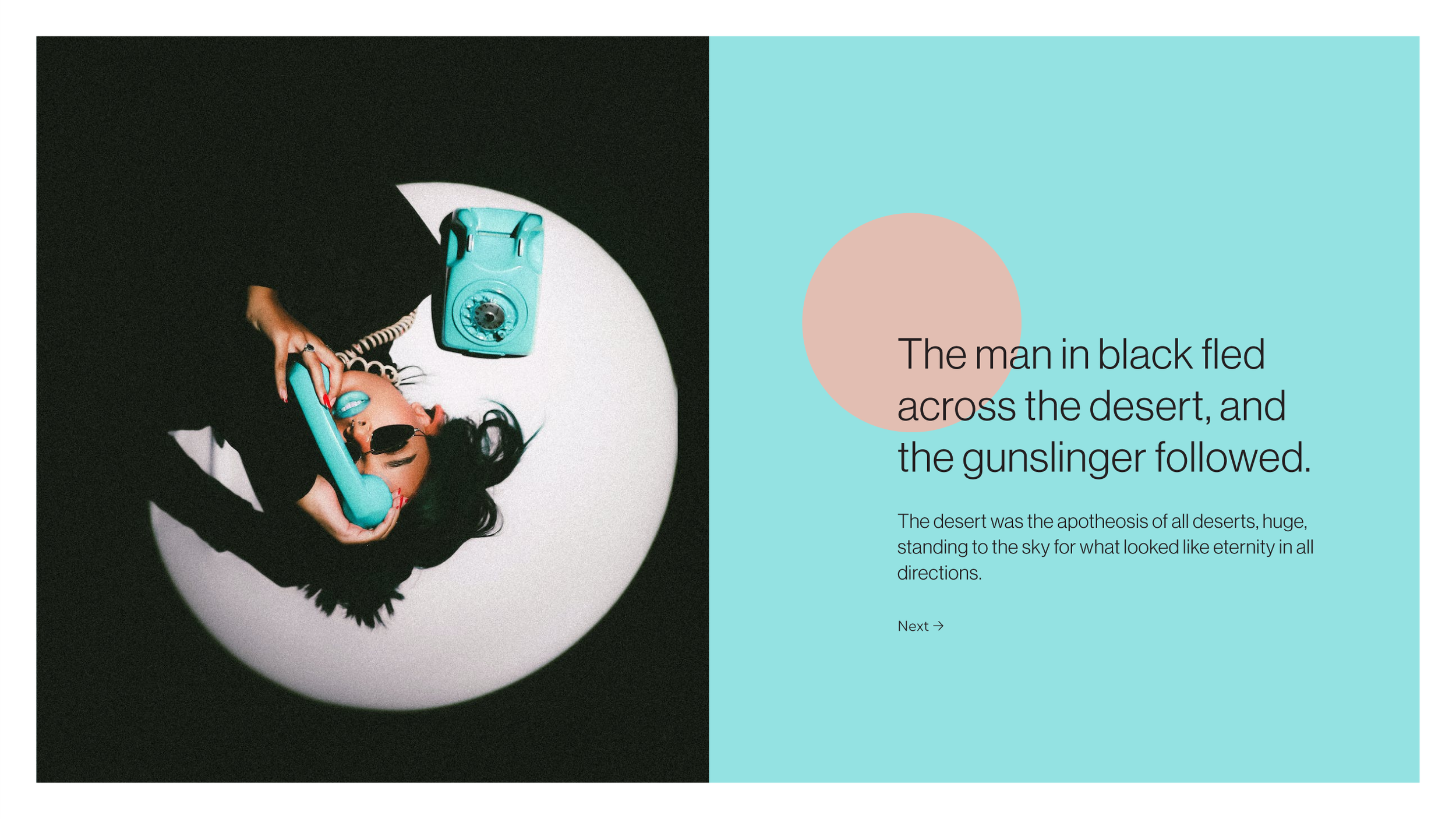
Palette— The three colours and the photo combined create a really effective slide.
🚀 Where to Start
Playing with colour is fun.
Developing a feel for combinations and how to apply it only really comes with practice, so the more fun you have the better you’ll be get.
For functional slides though, stick to a minimum of three colours until you build up your appreciation.
Humanosity is a design and communications studio dedicated to work that has a positive impact on the world.
Get in Touch to see how we can help your organisation.